Firstly, what is the responsive
In plain English, when users is visiting website by different device, like laptop, phone, the website could appear perfectly in different size of screen or landscape.
The most important elements are :
1. fluid grid
2. flexible images
3. media queries
1. First fluid grid
1. using media queries. to set screen size clearly.2. set other element size into keyword, percentage, em.(about em is important
here is one blog to explain: http://alistapart.com/article/fluidgrids)
Here is one example,
https://www.youtube.com/watch?v=dwxtjbYNF_8
In this example, it includes:
one container called wrapper: using media queries to set different size for different screen

other elements in the wrapper: using percentage(according to container size).
Another example,
http://alistapart.com/d/fluidgrids/examples/grid/final.html
(explain later..)
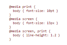
3. media queries
How to specify media dependencies for style sheets:1.In style sheet

or

in @media rule,
2. In HTML(link)

1. Conditional comments are the preferred means of differentiating Cascading Style Sheets (CSS) rules intended for specific versions of Internet Explorer.
media type word,

braille

embossed
No comments:
Post a Comment